[This is the recommended paper! ] Recommended paper for printing art and paintings according to style
目次
この記事について
PHOTOPRI(フォトプリ)
プロ品質の写真プリントサービス
「PHOTOPRI(フォトプリ)」は、写真展クオリティのプリントを提供する専門店です。一枚一枚の色を丁寧に調整し、30種類以上の用紙から最適なものを提案。あなたの作品が持つ魅力を最大限に引き出すお手伝いをします。大切な作品を、最高の形で残しませんか?
What is the best printing paper for art and illustrations? Professional advice on how to choose and recommended papers

Your work will shine even more when you choose the best paper.
"I want to print my artwork with the highest quality."
"Which paper should I choose for analog illustrations or digital illustrations to convey the appeal of my work?"
For artists who are passionate about their creative endeavors, the process of "printing" their work into a physical form is extremely important. The type of paper used, in particular, has a significant impact on the impression of the work, color reproduction, and even long-term preservation.
In recent years, we at PHOTOPRI have been receiving many inquiries such as, "What paper is best for printing artwork?" and "Which paper is recommended for this illustration?" In this article, we will explain in detail the specific points to consider when choosing paper for printing artwork and illustrations, as well as the recommended paper for each style of artwork. We hope to help you find the perfect paper to take your work to new heights.
Key points of this article
- The basics of paper selection that influences the impression of artwork
- Recommended paper for different styles of artwork, including oil painting, watercolor painting, and digital illustration
- Glossy paper and matte paper: their characteristics and how to use them
- PHOTOPRI's commitment to high-quality printing technology and paper lineup
- How to use "trial printing" and "paper samples" to avoid failure
3 Tips to Keep in Mind When Choosing Paper for Artwork
When choosing the best paper for your work, it's important to understand a few basic points. Rather than just choosing randomly, try considering the following three points:
1. Consider the location and lighting conditions of your artwork
Where and how you plan to display your work is an important criterion for choosing paper.
- Indoor or outdoor display: If you are displaying outdoors or in a place with lots of natural light, a matte paper is best as it reduces light reflection.
- Type of lighting: The lighting in the exhibition hall (spotlights, diffused light, etc.) will affect the reflective properties of glossy paper and the texture of matte paper. If the light is too direct, the glossy paper may be difficult to see due to the reflection.
- Viewing distance: The texture you choose can change depending on whether the piece will be viewed closely from a close distance or viewed from a distance.
At PHOTOPRI, we have many years of experience producing prints of the quality required for photo exhibitions and art exhibitions , and we can provide advice tailored to the exhibition environment.
2. Understand the types and characteristics of paper (glossy, matte, etc.)
The papers handled by PHOTOPRI can be broadly categorized into "glossy" and "matte," and even within these there are a wide variety of variations.
-
Glossy paper:
- The surface is glossy and has a smooth feel.
- Colours are expressed vividly and the contours of photographs and illustrations appear clear and sharp.
- This is suitable for adding a touch of glamour and impact to your work.
- Examples: EPSON Professional Photo Paper (glossy, silk), Hahnemuhle FineArt Pearl, PICTORICO Semi-Gloss Paper , etc.
-
Matte paper:
- The surface has been processed to reduce gloss, and is characterized by a moist or rough texture.
- Because there is little light reflection, it gives a calm impression, and your eyes will not get tired easily, allowing you to view it carefully.
- It is suitable for adding depth, warmth, and a soft atmosphere to your work. It is very popular for art in general.
- Examples: Hahnemuhle Photo Rag, EPSON Velvet Fine Art Paper, Awa Washi Paper Kozo , etc.
-
Other papers (canvas, washi paper, etc.):
- Canvas: Ideal for those seeking the three-dimensionality and texture of a painting. Also suitable for reproducing oil and acrylic paintings, or for artistic expression of photographs. PHOTOPRI offers high-quality canvas media .
- Washi: A traditional Japanese material characterized by its unique texture and warmth. Perfect for ink paintings, calligraphy, and warm photographs. For more information, please see our Washi lineup .
Statistically, when printing illustrations or artwork, many customers tend to choose matte fine art paper . The reason for this is thought to be that it faithfully reproduces the delicate nuances and textures of the artwork, making it easier for viewers to immerse themselves in the world of the work.
3. Match it to the theme and message of the piece
The texture and color of the paper will greatly affect the impression that your work leaves on the viewer. It is important to choose paper that matches the theme of your work, the message you want to convey to the viewer, and the atmosphere you want to express.
- Powerful expression, sharp impression: High gloss paper or metallic paper with a metallic luster.
- Soft expression, warm impression: cotton-based matte paper, Japanese paper, etc.
- Heavy, luxurious feel: thick fine art paper, velvet-like matte paper, etc.
If you are unsure which paper is best for you, please contact us at PHOTOPRI. We will ask you about the image of your work and suggest the best paper for you. First, we will show you all the paper samples .
*The number of varieties varies depending on the season. We recommend checking the actual texture.
Recommended printing paper for art and illustrations, categorized by style!
From here, we will introduce the specific papers recommended by PHOTOPRI for each of the major art styles. We will explain the characteristics of each paper and how it suits your artwork.
1. Oil and acrylic painting style works - making use of brush strokes and the texture of paint -

Choosing the right paper is key to reproducing the unique luster and brushstrokes of oil paints.
Oil and acrylic paintings, which are characterized by brush strokes, raised paint, and a unique luster, require paper that can make the most of these textures.
- Recommended Paper ①: [EPSON] Premium Satin Canvas
-
Among canvases, this media has a moist and elegant luster. It is ideal for faithfully reproducing the texture of oil paintings and other art, and is often used for producing reproductions. Some artists even add additional touches after printing. PHOTOPRI also offers canvas stretching services , allowing for professional exhibitions.

- Recommended Paper 2: [CLAESSENS] White Matte Canvas
- This highly white, matte canvas is ideal for those seeking a subdued finish while still capturing the texture of oil or acrylic paintings. It is also suitable for exhibition environments where you want to reduce reflections.
- Recommended Paper 3: [EPSON] Professional Photo Paper, Thick Glossy
-
This is the recommended paper for general paper-based printing. Because the paper surface has no noticeable texture, it does not impair the strength and three-dimensionality of the brush strokes in the artwork. Furthermore, glossy paper has a wide color gamut, allowing for vivid color expression. PHOTOPRI supports RGB direct printing , which faithfully reproduces colors adjusted on the monitor, making it a major advantage for artists who are particularly particular about color.

PHOTOPRI POINT: Depth of color and texture are important when reproducing oil paintings. Our ultra-high-definition 2880 x 1440 dpi giclee prints vividly reproduce the subtle color variations and brushstroke details of the paint.
Check the paper that suits your oil painting with a trial print
2. Watercolor-style works: Beautiful gradations of blurred and pale colors

Selecting the right paper will bring out the beauty of the delicate color transitions and bleeding of watercolors.
The soft colors unique to watercolors, the gradations created by bleeding, and the harmony with the texture of the paper—matte, textured fine art paper is ideal for beautifully expressing these elements.
- Recommended Paper ①: [Hahnemuhle] Torchon
-
This fine art paper from the prestigious German company Hahnemühle is known for its coarse grain and unique texture, which translates to "torch-burned" texture. Hahnemühle, which also has a proven track record in watercolor paper, developed this paper with a texture ideal for fine art printing. It features an inkjet coating that beautifully expresses subtle gradations of ink bleed, and the paper's texture adds a special touch to your artwork.

- Recommended Paper 2: Hahnemuhle Photo Rag
- This 100% cotton matte fine art paper is a representative example. Its extremely smooth and soft surface faithfully reproduces the delicate tones and hues of watercolors. It is a standard paper highly acclaimed by photographers and artists around the world.
- Recommended Paper 3: [Awa Washi] Kozo, Thick, White
- This is traditional Japanese paper made from kozo (paper mulberry) and is characterized by its unique texture and warmth. It is compatible with inkjet printers and brings out the Japanese taste and soft atmosphere of watercolor paintings. It is recommended for adding a unique look to your work.
PHOTOPRI Point: To accurately reproduce the subtle hues of watercolor paintings, PHOTOPRI also offers a color correction service (for a fee) by professional staff . You can pursue your ideal color by checking the finished product with a test print.
See more matte fine art papers for watercolor painting
3. Digital Illustrations and Anime-Style Illustrations: Vividness or Calmness?

Choose the best paper to bring out the charm of your characters.
For illustrations created with digital tools or anime-style character illustrations, the choice of paper will vary greatly depending on the atmosphere you want to express. Choose a paper that suits your purpose, such as "I want an eye-catching impact," "I want to highlight the character's transparency," or "I want to show the illustration in a calm and intimate way."
- If you want gloss and vividness, choose glossy paper
-
[EPSON] Crispia High Gloss Photo Paper : The paper itself has a high whiteness, and the ink colors are extremely vivid. It reproduces the colors of characters clearly, creating a sense of transparency and luxury. It's ideal for when you want a striking finish.
Other glossy papers : Epson Professional Photo Paper Heavyweight Gloss and Pictorico Semi-Gloss Paper are also popular for their vibrant colors and ease of handling. Semi-gloss has a slightly less glossy finish but still maintains vibrant colors and is less susceptible to fingerprints.
- If you value calmness and texture, choose matte paper
-
[EPSON] PX Premium Matte Paper : A matte paper highly recommended by illustrators. Its subdued glossiness allows you to present your work with a subdued atmosphere. It's ideal for capturing the delicate expressions of characters and the artist's thoughts. It offers simple yet solid color reproduction.

Hahnemuhle Photo Rag : With its high-quality matte finish and smooth texture, it gives your illustrations a luxurious feel and depth. It also has excellent color reproduction, beautifully expressing even the finest details.
PHOTOPRI Points: Because digital illustrations are created on a monitor, color reproduction when printed is important. PHOTOPRI supports data submission and printing not only in sRGB, but also in the wider color gamut of Adobe RGB. This allows you to more faithfully reproduce the colors you intended on the monitor in print. For more information, please see About Submitting Data .
Find more recommended papers for illustrations
4. Geometric Patterns and Graphic Design Art: Sharpness and Color Fidelity

Select paper that beautifully reproduces straight lines, curves, and different colors.
Geometric art and graphic design works, which are expressed through straight lines, curves, and colored surface compositions, require sharp edges, uniform color, and faithful reproduction of the intended colors.
- For sharpness and vividness: [EPSON] Professional Photo Paper, Thick Gloss
-
This paper is considered a standard for this type of work. Because it has no noticeable texture on the surface, it expresses the edges of straight and curved lines very sharply, directly conveying the appeal of a work with a simple composition. Its high color reproducibility also faithfully reproduces vivid colors.

- For a more subdued or textured look: Matte Fine Art Paper
-
It's interesting to create a calm atmosphere with a matte texture, or to add accents to your work with the texture of the paper. A smooth matte paper like Hahnemuhle Photo Rag brings out the depth of color while maintaining sharpness. Also, paper with a printmaking paper-like texture like Hahnemuhle German Etching will give your work a unique character.
PHOTOPRI Point: For graphic design, creating and submitting data in RGB instead of CMYK allows for more vivid printing with a wider color gamut. PHOTOPRI printers have a rich range of expression with 16.77 million colors, and provide prints that make the most of wide color gamut spaces such as Adobe RGB.
Check the prices of various paper types
Unsure about printing your artwork? Steps to avoid mistakes
If you're still unsure which paper to choose, try following the steps below.
Step 1: Matte paper is a safe and high-quality option
There's a reason why many artists choose matte paper. It has the advantage of having less light reflection and making it easy to view the work from any angle, so it's easy to choose a suitable exhibition location. The matte texture also gives the work a sense of calm and depth, making it easier for viewers to immerse themselves in the world of the work.
In particular, high-quality matte fine art paper from companies like Hahnemühle and Canson offers excellent color reproduction, tonal expression, and long-term preservation, making it a reliable choice for your artwork.
"One of the benefits of printing on matte paper is that it's less tiring on the eyes. Don't you get tired looking at something that's highly reflective for a long time? Less eye strain means viewers can stand in front of the work for longer periods of time." (PHOTOPRI staff)
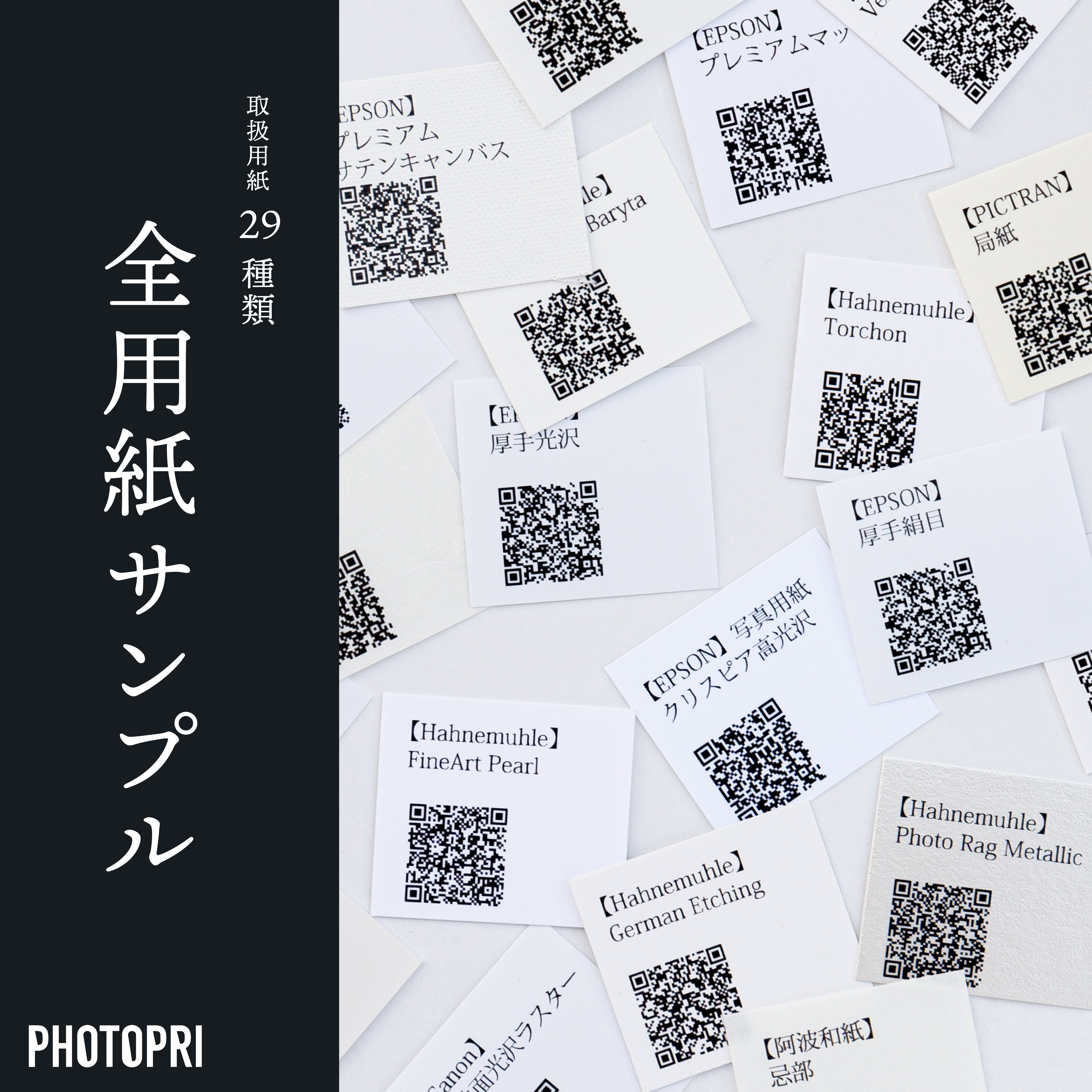
Step 2: Check the actual product with the "All Paper Samples"
Seeing is believing. You can't really tell the texture, thickness, and color of paper until you actually hold it in your hands. PHOTOPRI offers sample sets cut from all 23 types of paper we carry (for a fee). *The number of papers may vary depending on the season.
Find the perfect image based on your vision for your project. This step is especially important before ordering expensive fine art paper or large-format prints.
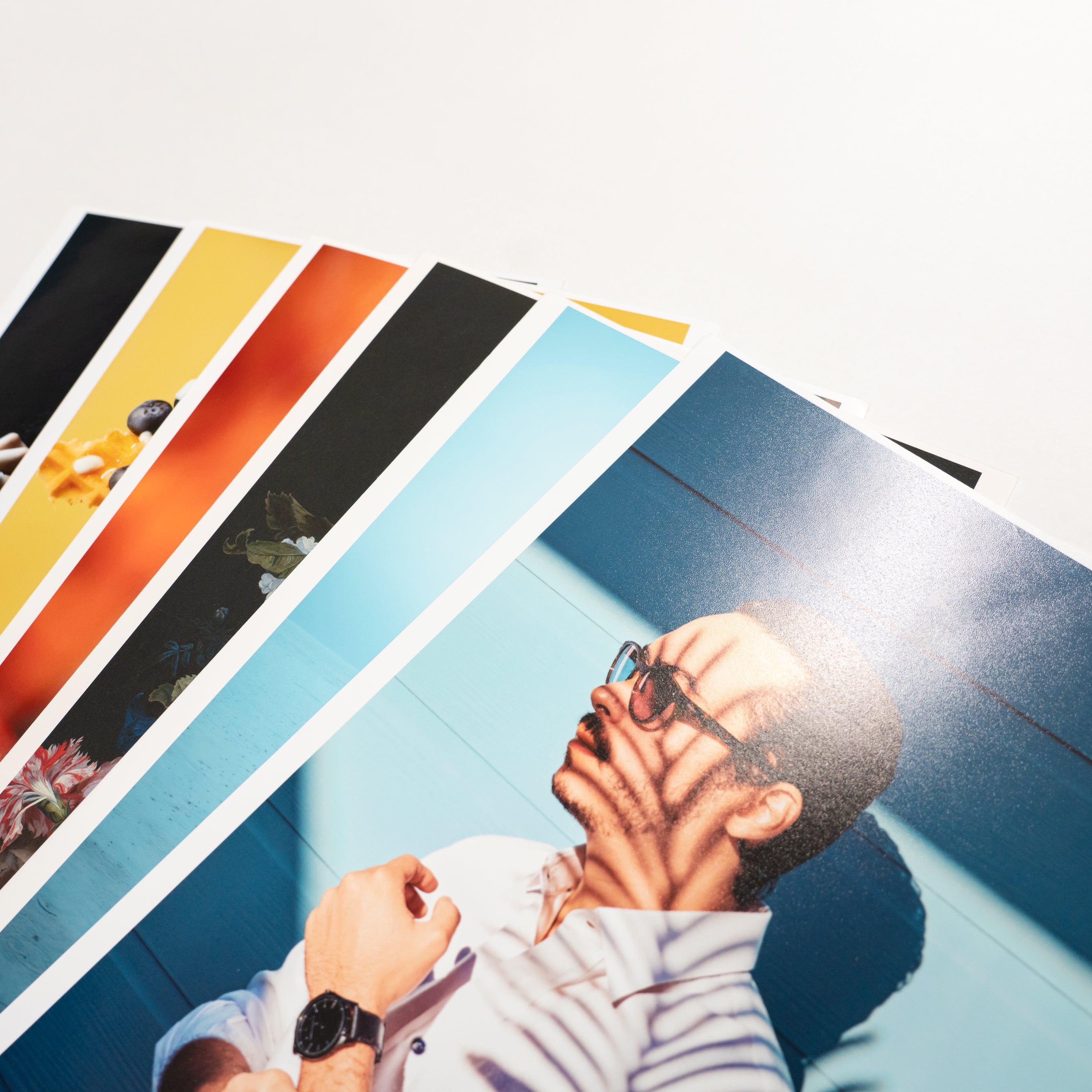
Step 3: Check the actual results with a "Test Print"
The most reliable way to find out is to actually print your own work data on the paper you're interested in. PHOTOPRI's "Trial Print Service" allows you to print in A5 size on the paper of your choice and check the actual finish and color.
There will inevitably be differences between the colors you see on your monitor and the colors that are actually printed on paper. By using this service, you can make adjustments before printing, allowing you to create work that is closer to your ideal.

Why not check the finish of the paper you're interested in using your work data?
Step 4: Talk to a PHOTOPRI expert
If you are still unsure, please feel free to contact us at PHOTOPRI. Our experienced, specialized staff will listen to your requests and the content of your work, and suggest the best paper and printing method. Please use this form to contact us. Corporate customers can also use the corporate form .
Why choose PHOTOPRI? To maximize the artist's expression
At PHOTOPRI, we don't just print images on paper; we have a variety of commitments to help artists realize their desire to "express their work in the best possible way."
- Ultra-high definition giclee print: With an incredible resolution of up to 2880 x 1440 dpi, every detail of the artwork is reproduced with vivid clarity.
- Wide color gamut RGB direct printing: Print directly in the sRGB or Adobe RGB color space, the standard for digital cameras. This minimizes color shifts caused by CMYK conversion, ensuring colors that are close to what you see on your monitor.
- Carefully selected high-quality paper: Choose from a wide range of internationally acclaimed art papers such as Hahnemühle, Canson, and Pictorico, as well as traditional Japanese washi paper.
- Genuine ink for long-term preservation: Genuine Epson ink is used, ensuring lightfastness for over 30 years, preserving the beauty of your work for a long time.
- Support tailored to the artist: We provide total support for the presentation of your work, from advising on paper selection, checking print layouts , framing and panel processing, to creating caption panels .
For more information, please see the PHOTOPRI service introduction page .
Summary: Choose the right paper to take your artwork to the next level
When printing artwork or illustrations, the choice of paper is an important factor that greatly affects the value of the work. Choose the most suitable paper by considering the taste of the work, the exhibition environment, and above all, the message you want to convey through your work.
At PHOTOPRI, we offer high-quality printing technology, a wide selection of paper, and expert staff to fully support you in your creations. We hope this article will help you choose the right paper.
If you would like to try out which paper is best suited to your project or would like to hear more, please feel free to use our trial printing or paper samples , or contact us .
Would you like to create your work with the highest quality?
PHOTOPRI supports your creative endeavors with professionally selected printing services of photo exhibition and art exhibition quality.
View PHOTOPRI service detailsView paper lineupRelated keywords
この記事を書いた人
PHOTOPRI(フォトプリ)
プロ品質の写真プリントサービス
「PHOTOPRI(フォトプリ)」は、写真展クオリティのプリントを提供する専門店です。一枚一枚の色を丁寧に調整し、30種類以上の用紙から最適なものを提案。あなたの作品が持つ魅力を最大限に引き出すお手伝いをします。大切な作品を、最高の形で残しませんか?
