[I tried printing] The charm of EPSON PX premium mat
目次
この記事について
PHOTOPRI(フォトプリ)
プロ品質の写真プリントサービス
「PHOTOPRI(フォトプリ)」は、写真展クオリティのプリントを提供する専門店です。一枚一枚の色を丁寧に調整し、30種類以上の用紙から最適なものを提案。あなたの作品が持つ魅力を最大限に引き出すお手伝いをします。大切な作品を、最高の形で残しませんか?

Naive.
This is the impression I had when I first encountered [EPSON] Premium Matte Paper (hereinafter referred to as Premium Matte Paper).
I believe that the photo printed on the paper at that time was ``Lake at Night.'' The moon was out and there was a boat floating on the shore of the lake at night. When I look at the boat and the lake, I notice that there is a huge mountain behind me. I think it was a common photo that gives you a sense of Japan.
I think the reason these Japanese-style photos looked so simple to me was because the paper they were fixed on was premium matte paper.
The feelings that each person puts into a single photo vary from person to person. I also love photography and enjoy traveling to various places to take photos. Breath-taking moments often occur during photo shoots, and this premium matte paper allows you to express the feelings you feel on set in a truly poetic way . And once you finish printing, you'll want to keep it with you forever as an important "thing". This is such a paper.
In this article:
“What are the characteristics of premium matte paper?”
“What kind of photographic expression will it be?”
I would like to write this for those who have this question or those who want to know more about paper in order to adopt premium matte paper.
<Handling paper>Hue no Hanashi
As I mentioned above, ``The reason why the photos looked more innocent to my eyes was because the paper they were fixed on was premium matte paper,'' and ``They really poetically express the feelings I felt at the scene.'' However, I thought about why prints made using premium matte paper feel simple and give poetic expression.

The first thing to consider is that the photo data is dominated by achromatic colors such as black, gray, and white, and cool hues such as navy and purple. I think that a photo that makes you think of it as a ``simple photo,'' ``calm photo,'' or ``moist photo'' at first glance satisfies this condition. (In the above photo, the colors are roughly divided into: plants: black, sky and lake: navy, moon: white, and moonlight reflected on the water surface: orange.The color information used is rather small, with 4 colors. You can say that.)
Photos with warm or neutral colors scattered all over the screen like colorful jelly beans, or photos that give the impression of being shiny or capy, may have a hard time conveying their "purity" even if printed on premium matte paper. not. (There may be people who like printing colorful photos on premium matte paper, or who have techniques to make colorful photos look simple. Ultimately, the choice of paper is up to you, and you may think, ``If this is the type of photo, this is the one you want.'' I would appreciate it if you could just say, ``The paper is suitable.'')
In other words, the above-mentioned photograph of ``A boat floating on a moonlit night'' met this condition. The photo contained many achromatic and cool colors. I think this is the first element of the production of "naivety".
color tone
Next are photos with tones such as monochrome, selenium, and sepia. I think everyone involved in photography, whether professional or amateur, has had the experience of taking monochrome photos at least once.
Personally, there are days when I decide to take only black and white photos today, and I think it's a genre that can be both interesting and difficult. I've heard that this is essential for improving your photography skills, as it allows you to search for subjects based on "light and shadow" rather than "color." (By the way, I still don't understand what black and white photography is. I want to improve my photography...)

Photos taken in monochrome tone are simple with little color information, and can give off a sense of "oldness" in a good sense, while sepia tone can also add a sense of sadness. Since there is less color information, it is possible to highlight the character of the subject.
In other words, if you take a photo (edit it) with different tones, the photo data will consist of two colors, and the amount of color information will be extremely limited . I think this is the second element for creating a "poetic expression".
Choice of premium matte paper
By using premium matte paper, the viewer can feel that it is a ``naive'' and ``poetic expression.'' I feel that this paper is the perfect choice when printing photo data with little color information , just as I felt when printing the photo of ``A Boat Floating on a Moonlit Night.'' Of course, it depends on the environment where the printed matter will be displayed and for whom, but it is certainly reassuring that it is a versatile paper .
Conversely, if the photo contains a lot of color information (such as a colorful photo), the color reproducibility will be low, and the image may appear dull or muffled. For example, if you want the black to be more intense or to give it a crisper look, I think using glossy paper instead of premium matte paper will give you a cool result closer to your image.
With so many different types of paper available, we hope that this premium matte paper will remain in your heart.
bonus
We are sorry to introduce paper that is not available at PHOTOPRI, but when it comes to printing black and white photos, we also recommend Gold Shiny and White Film from the PICTORICO series .
They are sold in smaller sizes such as A4, A3, and A3 size, so if you have space at an exhibition, for example, why not add them as one of the photos to brighten up the venue? The coolness of Gold Shiny is second to none.
Would you like to try printing on premium matte paper?
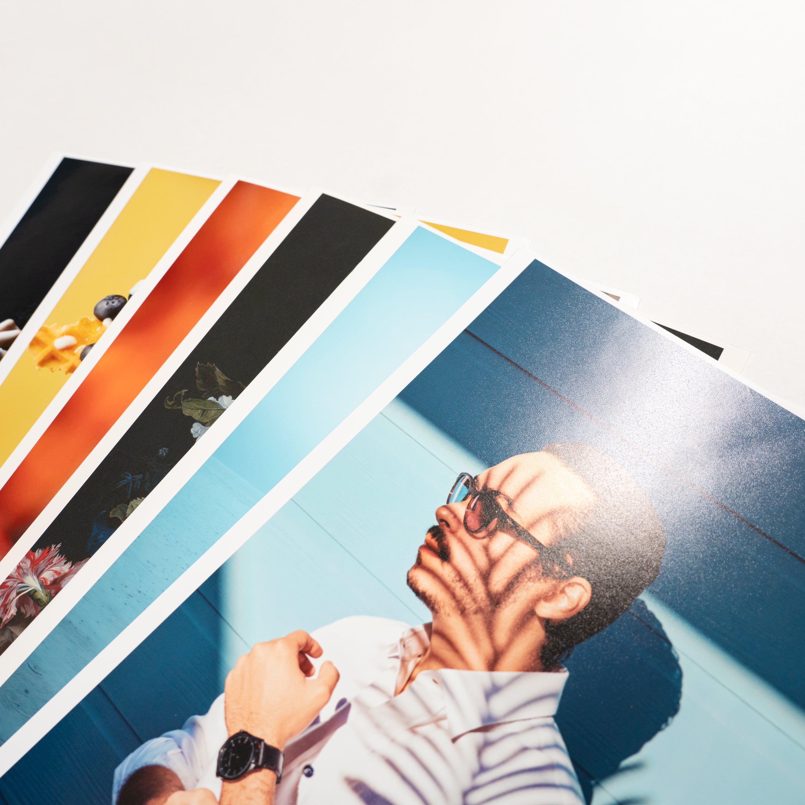
Just like you take a test drive when you buy a car, we want you to use the trial print service and experience the paper for yourself before printing.
You can't really understand the texture, texture, color reproduction, etc. of a wide variety of papers, such as glossy paper, matte paper, fine art paper, and Japanese paper, until you actually hold the printed material in your hands.
Even if you try to choose the best one from a large number of papers, it may be difficult. There are many people who don't know which one to choose.
You can print a trial print using your own photo data .
We have a trial set that suits your preferences, so please take advantage of it!
この記事を書いた人
PHOTOPRI(フォトプリ)
プロ品質の写真プリントサービス
「PHOTOPRI(フォトプリ)」は、写真展クオリティのプリントを提供する専門店です。一枚一枚の色を丁寧に調整し、30種類以上の用紙から最適なものを提案。あなたの作品が持つ魅力を最大限に引き出すお手伝いをします。大切な作品を、最高の形で残しませんか?

.%0A%0A%20I%20believe%20that%20the%20photo%20printed%20on%20the%20paper%20at%20th...)