[Recommended paper is this! ] Recommended paper for illustration printing by style
目次
この記事について
PHOTOPRI(フォトプリ)
プロ品質の写真プリントサービス
「PHOTOPRI(フォトプリ)」は、写真展クオリティのプリントを提供する専門店です。一枚一枚の色を丁寧に調整し、30種類以上の用紙から最適なものを提案。あなたの作品が持つ魅力を最大限に引き出すお手伝いをします。大切な作品を、最高の形で残しませんか?
[Illustration Printing] Make your work shine! Recommended paper and tips on how to choose it

Would you like to preserve your masterpiece in the best possible form?
"Drawing a picture."
Back when analog illustrations were mainstream, there weren't as many people drawing digital illustrations on computers or tablets as there are now. Tablets have only become popular in the last 10 years or so, and for those who appreciate the unique expressive qualities of analog, there may have been some resistance to the transition to digital.
Both analog and digital methods have their own wonderful merits. For artists, the value of their creative activity remains the same regardless of the method. We find it inspiring and wonderful to see artists who simply enjoy the act of drawing itself. We are sure that many people have been influenced by such artists and have awakened to the joy of appreciating art (our staff is one of them!).
Recently, we have been receiving an increasing number of inquiries from customers who order from PHOTOPRI, such as, "Which paper is best for printing illustrations?" So, in this article, we would like to answer your questions and summarize the recommended papers for printing illustrations.
In this article,
- "Are there certain papers that are suitable for illustrations and some that are not?"
- What kind of paper is best suited for my illustrations?
We will be answering these questions and introducing specific points to consider when choosing paper and recommended paper types, so please use this as a reference!
Start here! 3 tips for choosing illustration paper
When you actually want to print, there are so many different types of paper that it can be hard to decide which one to choose. To avoid making a mistake when choosing paper, let's start by understanding the basic points.
1. Where and how will you display it? Imagine the exhibition location.
The first thing to do is to have a concrete idea of where and how you will display the printed illustrations.
- Indoor or outdoor display? If outdoors, weather resistance must also be considered.
- What about the lighting in the exhibition hall? The impression you get from a work is very different when it is displayed in your own room than when it is displayed in a lit exhibition hall. Is there a single light, multiple lights, or is there natural light? The amount of light is an important factor that affects the impression you give to the viewer.
For example, highly glossy paper can reflect light and become difficult to see when it is directly illuminated. Understanding the exhibition environment in advance will help you choose the appropriate paper.
2. Learn about the major differences between glossy and matte paper
The paper we offer at PHOTOPRI can be broadly divided into two types : "glossy" paper and "matte" paper .
A brief explanation of each feature is as follows:
-
Glossy paper :
- The surface of the paper has been given a glossy finish, making it smooth to the touch.
- The colors of photographs and illustrations are reproduced vividly and clearly, giving a rather vibrant and sharp impression .
- The contours of the subject or illustration are clearly defined, making the work easy to see.
- (Photopri products include: Professional Photo Paper Thick Gloss , Crispia High Gloss , etc.)
-
Matte Paper :
- The paper has been processed to reduce the gloss of its surface, giving it a moist or slightly rough texture.
- Because it reflects less light, it gives a calm, rather moist and elegant impression .
- Although it is not flashy, the advantage is that it does not strain the eyes and makes it easier for people to take their time to appreciate the artwork.
- (Photopri products include PX Premium Matte Paper , MC Art Paper , Hahnemühle Photo Rag , etc.)
Based on past order statistics, many people tend to choose matte paper when printing illustrations. Of course, the best paper will vary depending on the style of the work and the expression you are aiming for.
PHOTOPRI's Commitment: At PHOTOPRI, we support RGB direct printing, which makes use of the wide color gamut of digital data, without the typical CMYK conversion. This allows us to achieve rich color expression that is close to the image seen on the monitor, especially on matte paper. For more information, please see the Data Submission Guide page .
3. What do you most want to show in your illustration?
Is it the character's facial expression? The vividness of the colors? Or perhaps the overall atmosphere and texture of the work? By clarifying what you most want to express with your illustration and what you most want to convey to the viewer , your paper options will naturally narrow down.
If you're unsure which paper is best for your illustration , be sure to take advantage of our trial prints and full paper samples . The best way to find out is to actually hold the paper in your hands and check the texture and color!
Click here for trial prints Click here for all paper samples[Character Illustration Edition] Recommended Paper and Expression Points

(Examples of work by Yugashi @dagasi_yk . *Please use images that have been approved for publication. Please refrain from reproducing on other sites without permission.)
Characters that appear in manga, anime, and games are one of Japan's most representative cultural assets, and there are many people who create their own original characters.
I think there are many illustrators who pursue "what they want to express about the character" while thinking about "what kind of impression they want to leave on the viewer," such as "I want to create an overall rough feel" or "I want it to have an impact that catches the eye."
When printing character illustrations, I think it's a good idea to base your paper selection on whether or not you want the work to have a vibrant expression .
If you want a glossy look and transparency, choose glossy paper.
If you are looking for a glossy look, we recommend glossy paper . In particular, the paper sold by Epson, "Epson Crispia High Gloss Photo Paper ," is popular for both photos and illustrations.

(The above is an example of Crispia. It's an example of a portrait print, but look at the glossiness. The beautiful reflection is breathtaking.)
Among glossy papers, Crispia is popular because the whiteness of the paper itself stands out, allowing illustrations to stand out clearly and creating a sense of transparency and luxury . If you want to bring out the transparency and vividness of your characters, this is one of the papers we recommend.
If you want a calm atmosphere and emphasize the character's worldview, choose "matte paper."
The appeal of matte paper is that it gives a calm and elegant impression . If you want to carefully express the atmosphere and worldview of a character rather than a glossy expression, we recommend matte paper.
When printing character illustrations, the rough, or rather simple feel of a single image is surprisingly well-suited, and I think there are quite a few illustrators who are hooked on this. In particular, the EPSON PX Premium Matte Paper has been highly praised by many people.

(↑An example of premium matte paper. It doesn't have a glossy finish, but the rustic colors are irresistible.)
I think Premium Matte Paper is the perfect paper for expressing the artist's desire to "preserve the atmosphere of the character" and the "charm" of the work in a straightforward manner.
<Photopri paper recommended for character illustrations>
- [EPSON] Crispia High Gloss Photo Paper <Go to product page>
- [EPSON] PX Premium Matte Paper <Go to product page>
For those seeking a more professional finish: PHOTOPRI also offers a color correction service (for a fee). If you would like to maximize the characteristics of the paper and achieve color reproduction that is closer to your imagination, please feel free to contact us.
[Geometric Illustrations] Recommended Paper for Impressive Sharpness

A beautiful geometric illustration with a combination of straight lines, curves, and colors.
Next, let's look at geometric artwork like the one pictured above. It's an illustration made up of simple elements like straight lines and curves, giving it a somewhat mathematical feel.
For this type of work, glossy paper is very easy to use and very popular . Among them, we especially recommend " EPSON Professional Photo Paper, Heavyweight Glossy ."
Illustrations created using simple techniques such as straight lines, curves, and different colors tend to have a "simple" and "sharp" quality to them (of course, there are also artists who create complex impressions using simple techniques).
Profoto Heavyweight Glossy paper has no noticeable texture (unevenness) on its surface, allowing it to faithfully reproduce "simple things simply and beautifully." Furthermore, glossy paper generally has better color reproduction (the range of colors that can be reproduced) than matte paper. In other words, colors appear more vibrant when viewed on glossy paper.
That said, matte paper does not necessarily result in significantly different colors being printed on it. Although there are matte papers with high color reproducibility, glossy paper tends to produce less difference from the colors seen on the monitor and tends to produce more stable output.
When printing geometric illustrations like this, we often receive requests to minimize the difference in color between what you see on a screen and the actual printed version. As someone who helps people create their artwork, we believe it is extremely important to aim for color reproduction that is as faithful as possible.
PHOTOPRI Papers Recommended for Geometric Illustrations
Fine art paper for the discerning artist: If you want to add texture and depth to your geometric designs, try a metallic fine art paper like Hahnemühle Photo Rag Metallic . Consider it if you want to add a new dimension to your artwork.
[Landscape Illustration Edition] Recommended Paper for Conveying Atmosphere

Landscape illustrations that convey the grandeur of nature and the atmosphere of the cityscape.
Finally, there are landscape illustrations. Whether analog or digital, landscape illustrations feature complex layers of color and the expression of light, and many people are drawn to their beauty.
When it comes to tasteful illustrations of "nature," it seems that the impression that is desired to be given to the viewer is often "simple" or "warm ." In fact, when it comes to landscape illustrations like this, there tends to be a high number of orders for matte paper.
(Of course, in the photo above, the house and trees are set against a solid mountain, not a glittering seaside town, so a more rustic look would be more appropriate. However, if you want to emphasize a bit more brilliance and vivid colors, you might be able to create an interesting effect by using glossy paper instead of matte.)
Among the matte papers, the one we particularly recommend is the Epson MC Art Paper . This paper has a slightly rough surface, which is a major feature that can add depth and dimension to printed materials .

The slight unevenness of the paper surface gives the work a rich expression.
This "roughness" refers to the fine irregularities on the paper surface. When the ink adheres to these irregularities, subtle shadows are created depending on how the light hits it, giving the work a three-dimensional appearance when viewed from a distance. MC art paper is also good at creating a "painterly" impression .
(In terms of "pictorial, " PICTRAN paper is also excellent, but this is a high-quality fine art paper, so we recommend using it for special, important works.)
One of the great attractions of MC art paper is that it can add the warmth and texture of analog art to digitally drawn landscape illustrations, so please give it a try. Also, for traditional Japanese landscapes or illustrations with a Japanese taste, we recommend using washi paper such as Awa washi , which has a unique texture.
<PHOTOPRI paper recommended for landscape illustrations>
- [EPSON] MC Art Paper <Go to product page>
- [PICTRAN] Newspaper <Go to product page>
- Various types of washi paper (e.g. Awa washi paper) <Go to product page>
If you're not sure what to choose, try this! We recommend "matte paper" to prevent mistakes when printing illustrations
So far we've talked about various illustration styles and paper types, but some of you may be wondering, "So, which paper is best for my illustrations?"
It's difficult to generalize whether there are certain papers that are "absolutely suitable" or "absolutely unsuitable" for printing illustrations. This is because the optimal paper varies depending on the intended use, the purpose of the printing, and above all, what the artist wants to express.
For example, if you were to display a highly glossy paper in a place where it would be exposed to direct sunlight or under strong lighting, the reflection would be so strong that it would be difficult to appreciate the work.
In that sense, we believe that in most cases, choosing a matte paper will lead to a paper selection that is relatively less likely to fail .
A major benefit of printing on matte paper is that it reduces eye strain . When you look at something with a strong reflection for a long time, don't your eyes inevitably get tired? (I'm a little worried, though, that this might be just me.) Less eye strain means that viewers can stay in front of the work for longer. And if they spend a long time looking at the work, I think they will be drawn even more into the world of the work.
In fact, many of the illustrators who commission their work at PHOTOPRI choose matte paper. Of course, this is not everything, but we hope that this will give you some ideas for choosing paper.
PHOTOPRI offers a wide variety of matte paper . Please take a look.
See PHOTOPRI's list of matte papers
"Seeing is believing" - take advantage of PHOTOPRI's free trial printing!
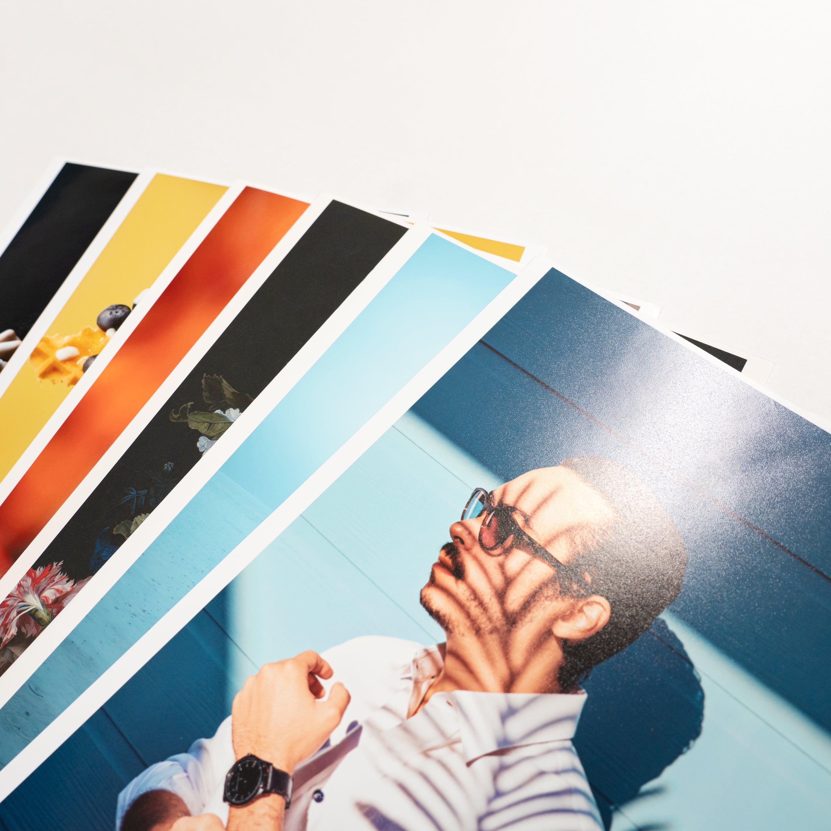
So far, we've talked about the best paper for each style of illustration and some tips on how to choose it. However, no matter how much we explain it in words, it's hard to convey the texture and color of the paper without actually seeing it with your own eyes and touching it with your own hands.
Just like taking a test drive before buying a car, we encourage you to try out PHOTOPRI's "trial print" service and experience the quality of our paper with your own eyes before committing to a full-scale print.

Check the results with your own data! "Trial Print"
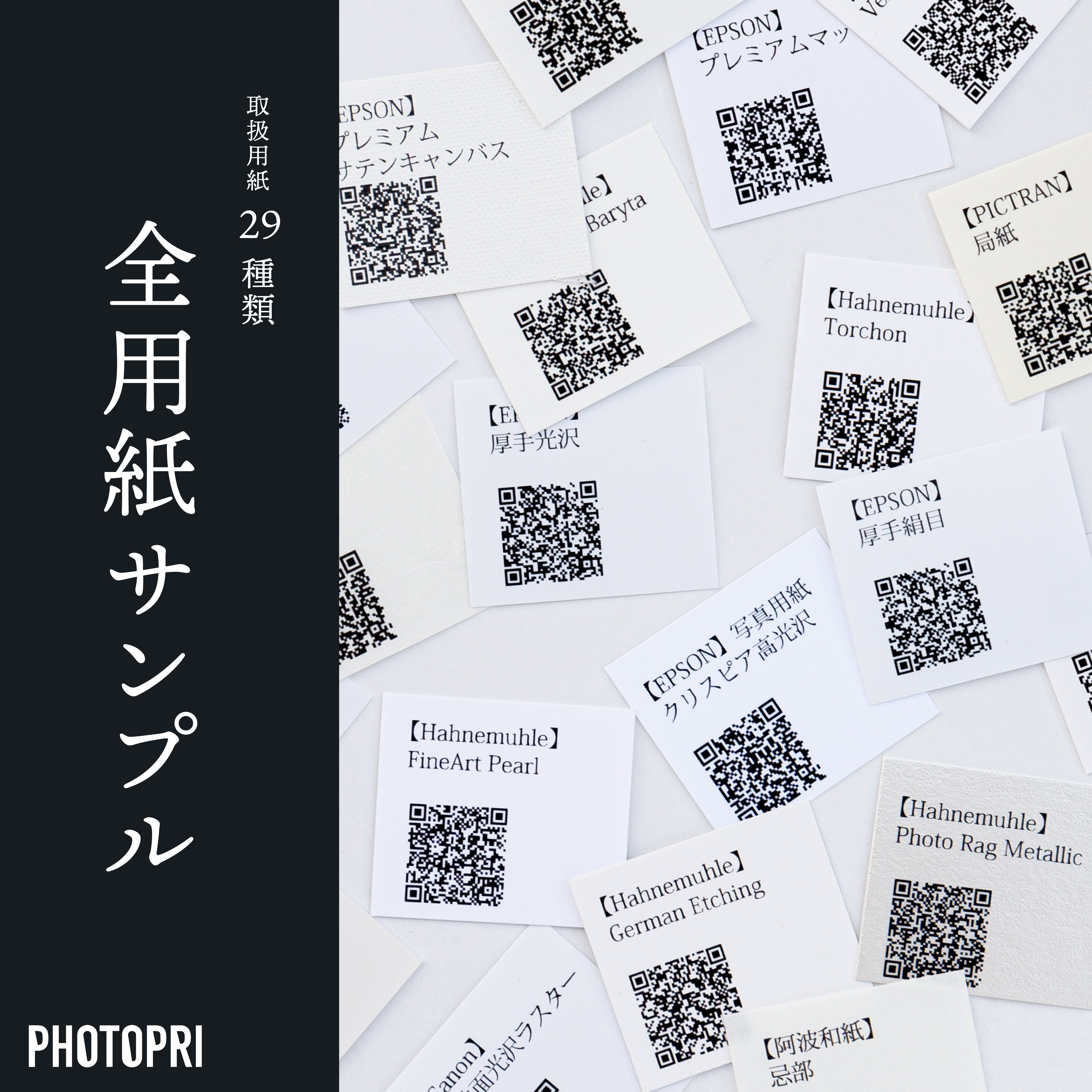
Covering over 23 types! "All Paper Samples"
There are many things you can't know until you actually get your hands on a printed piece, such as the texture and feel of each of the wide variety of papers, including glossy paper, matte paper, fine art paper, and washi paper, as well as the differences in how ink adheres and color reproduction. Even if you try to choose the best paper for your work from the many available, it can be difficult right away. There are many people who say, "I don't know which one to choose..."
PHOTOPRI's " Trial Print " allows you to use your own illustration data and print it on the paper of your choice (up to A5 size). We also offer a trial set so you can choose the paper that suits your taste, so please give it a try and see for yourself the quality!
We also offer " all paper samples " that allow you to actually hold and compare the major papers handled by PHOTOPRI. If you consider these as well, you will be able to make a more satisfactory paper selection. *The number of papers may change depending on the season.
Choosing the right paper is a very important step that will greatly influence the final impression of your illustration work. We at PHOTOPRI will fully support you in creating your work. If you are unsure about which paper to choose, please feel free to contact us .
Click here for a trial print Click here for all paper samples View more PHOTOPRI servicesRelated keywords
この記事を書いた人
PHOTOPRI(フォトプリ)
プロ品質の写真プリントサービス
「PHOTOPRI(フォトプリ)」は、写真展クオリティのプリントを提供する専門店です。一枚一枚の色を丁寧に調整し、30種類以上の用紙から最適なものを提案。あなたの作品が持つ魅力を最大限に引き出すお手伝いをします。大切な作品を、最高の形で残しませんか?
